

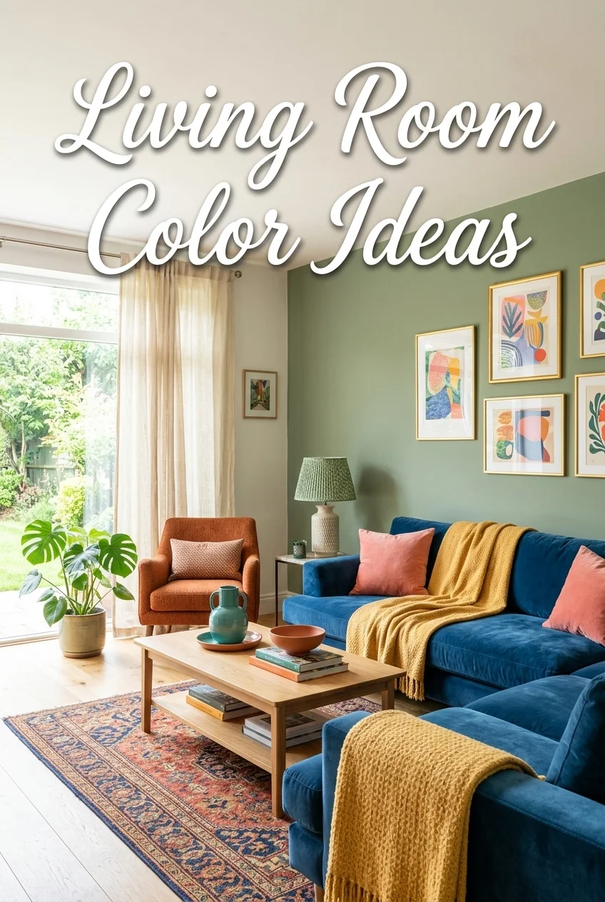
The best living room color ideas feature a balanced mix of neutral shades, earthy tones, calming greens, sophisticated blues, and eye-catching accent colors that work beautifully with your furniture, lighting, and overall décor. Choosing the right living room color palette can make your space appear brighter, larger, cozier, or more luxurious while creating a welcoming atmosphere that reflects your personal taste.
Table of Contents
- Why Your Living Room Color Matters
- How to Find the Best Color Palette for Your Living Space
- Best Living Room Color Ideas
- Popular Living Room Color Combinations
- Living Room Colors by Interior Style
- Choosing Colors Based on Room Size & Lighting
- Matching Furniture with Wall Colors
- Trending Living Room Colors for 2026
- Common Color Mistakes to Avoid
- Final Thoughts
- Frequently Asked Questions
Why Your Living Room Color Matters
Your living room is more than just a gathering space; it’s where family members relax, guests are entertained, and everyday moments unfold. The colors you choose play a significant role in shaping the room’s mood, comfort, and overall appearance. A carefully selected living room color palette enhances your home’s personality while improving both function and style.
Whether you’re planning a complete makeover or simply repainting the walls, understanding color psychology, lighting, and furniture coordination will help you make a confident decision. If you’re starting from scratch, our Home Decor Guide explains the essential design principles before choosing paint colors.
The Impact of Color on Mood and Comfort
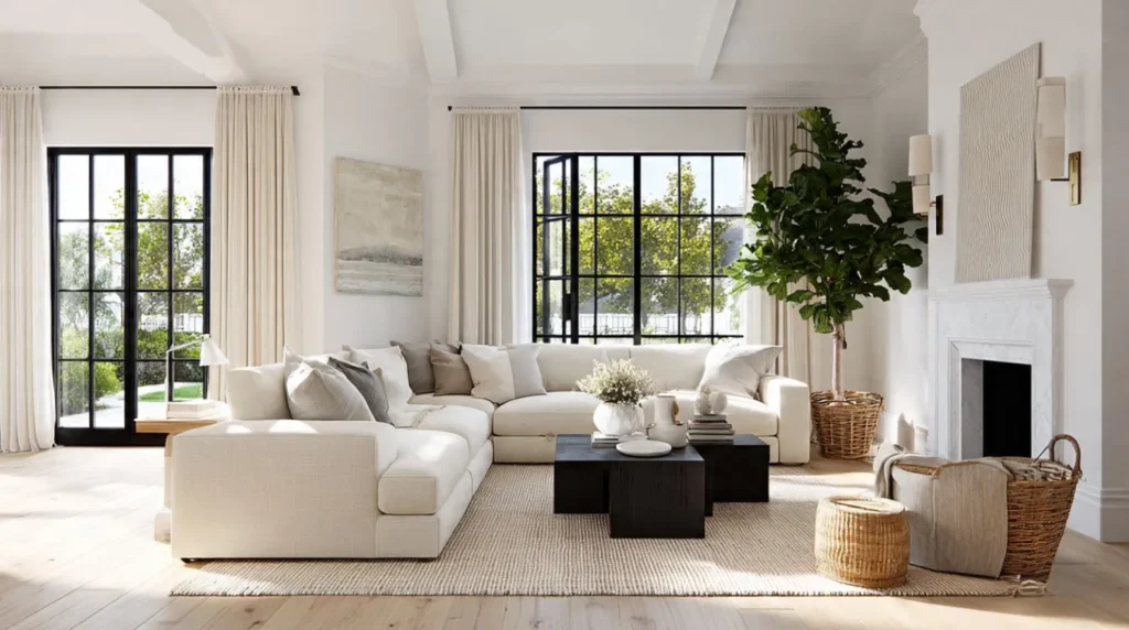
Every color influences how a room feels. Research on color psychology shows that different colors can affect emotions, comfort, and the perceived atmosphere of interior spaces. Warm colors such as terracotta, beige, and soft cream create an inviting atmosphere that encourages relaxation and conversation. Cooler shades like sage green, dusty blue, and gray provide a peaceful environment that feels calm and refreshing.
Neutral colors remain a favorite because they offer flexibility. They work beautifully with changing décor styles, making future updates easier without repainting the entire room.
Choosing the right balance between warm colors, cool colors, and neutral colors allows you to design a space that reflects your lifestyle while remaining timeless.
How Colors Influence Space and Brightness
Wall colors can visually change the size of a room. Lighter shades reflect more light, making compact spaces feel open and airy. Deeper shades absorb light, adding richness and sophistication to larger living rooms.
For example:
- White and cream maximize brightness.
- Soft gray creates depth without overwhelming the room.
- Navy blue adds elegance to spacious interiors.
- Sage green introduces a fresh, natural feel.
Understanding this relationship helps homeowners select colors that complement both room size and available lighting.
Creating a Cohesive Interior Design
Great interior design is built on harmony rather than using beautiful colors individually. Your wall paint should coordinate with flooring, furniture, rugs, curtains, artwork, and decorative accessories.
Maintaining visual balance through coordinated colors creates a polished appearance. Whether your home embraces modern, Scandinavian, Japandi, or luxury interior design, a consistent color scheme ensures every element works together naturally.
How to Find the Best Color Palette for Your Living Space
Before selecting a paint color, it’s also helpful to explore different living room decor ideas that match your preferred style and furniture layout. The best living room paint color ideas consider room dimensions, lighting conditions, existing furniture, and paint finishes to create a balanced and long-lasting design.
Here are the key factors every homeowner should evaluate before painting.
Consider Your Room Size
Room size has a direct impact on how colors appear.
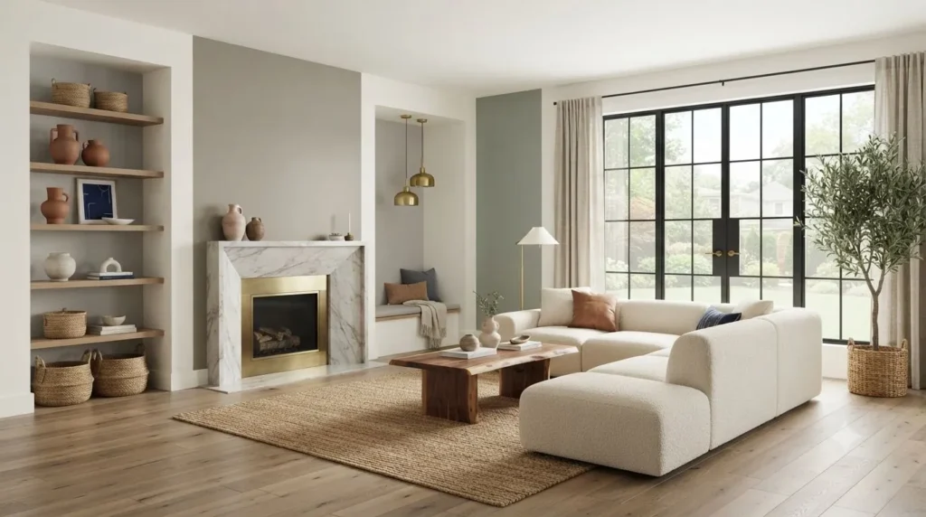
For smaller living rooms, lighter tones such as white, ivory, warm cream, greige, or pale sage green reflect more light, making the space appear larger.
Large living rooms provide greater flexibility. Rich charcoal, navy blue, olive green, or terracotta create warmth and help oversized spaces feel more inviting.
If your room features an open-concept layout, maintain color consistency between connected spaces to improve visual flow.
Evaluate Natural and Artificial Lighting
Lighting dramatically changes paint colors throughout the day. The U.S. Department of Energy explains that proper natural lighting improves both comfort and energy efficiency inside the home.
Rooms filled with natural light can successfully showcase cooler colors like gray, navy, and sage green because sunlight softens their appearance.
Rooms with limited daylight often benefit from warmer shades, including beige, cream, taupe, and warm white, which prevent the space from feeling cold.
Don’t overlook artificial lighting either. Warm LED bulbs enhance earth tones, while cooler lighting complements modern gray and blue palettes. Always test paint samples under both daytime and evening lighting before making a final decision.
Match Your Existing Furniture and Flooring
Your walls should complement, not compete with your furniture.
Consider these combinations:
- Gray sofas pair beautifully with white, sage green, navy blue, or greige walls.
- Beige furniture works well alongside olive green, cream, taupe, and soft blue.
- Walnut wood complements warm whites and earthy tones.
- Black leather furniture creates striking contrast against lighter neutral walls.
Also consider flooring materials such as oak, marble, hardwood, or luxury vinyl to ensure the overall palette feels cohesive.
Select the Right Paint Finish
Choosing the correct finish is just as important as selecting the color.
Matte Finish
- Excellent for low-traffic spaces
- Creates a soft, elegant appearance
- Conceals minor wall imperfections
Satin Finish
- Easy to clean
- Slightly reflective
- Ideal for busy family living rooms
Don’t forget the ceiling. Crisp white ceiling paint remains a classic choice because it reflects light and creates the illusion of greater height.
Best Living Room Color Ideas
Choosing the right color transforms both the appearance and atmosphere of your home. The following living room color ideas remain timeless while embracing the latest interior design trends for 2026. Each palette offers unique benefits, making it easier to find a style that complements your furniture, décor, and lifestyle.
Timeless White and Cream
White and cream continue to dominate modern interiors because they create a bright, elegant, and versatile foundation. These shades reflect natural light beautifully, making even compact living rooms feel more spacious.
White walls pair effortlessly with oak furniture, marble coffee tables, linen curtains, woven baskets, and indoor plants. Cream introduces additional warmth, preventing the room from feeling sterile.
For a luxurious finish, combine warm white walls with brass lighting, textured area rugs, and natural wood accents.
These colors work especially well in:
- Scandinavian interiors
- Coastal homes
- Minimalist living rooms
- Contemporary family spaces
Elegant Beige and Greige
Beige has evolved into one of the most sophisticated neutral choices for modern homes. Combined with greige, a blend of gray and beige, it delivers warmth without appearing overly traditional.
These shades complement the following:
- Walnut furniture
- Leather sofas
- Velvet accent chairs
- Brass décor
- Stone fireplaces
These neutral shades are frequently used in luxury living room design ideas because they provide a timeless backdrop for premium furniture.
Sophisticated Gray and Charcoal
Gray remains one of the best living room colors because of its incredible versatility.
Light gray creates a clean and contemporary atmosphere, while charcoal introduces depth and luxury. Together, they suit both modern and transitional interiors.
Pair gray walls with:
- White trim
- Black metal fixtures
- Marble surfaces
- Glass coffee tables
- Navy accessories
To avoid a cold appearance, soften the palette with warm wood finishes and textured fabrics.
Nature-Inspired Sage Green
Sage green continues to be one of the biggest interior design trends because it brings the calming beauty of nature indoors.
This earthy shade creates a relaxing environment while pairing effortlessly with white, cream, oak, rattan, and linen.
For added depth, incorporate olive green accents through throw pillows, artwork, or decorative vases.
Sage green is an excellent choice for a variety of interior styles, including:
- Japandi interiors
- Farmhouse designs
- Scandinavian homes
- Luxury modern spaces
Its timeless appeal ensures it remains stylish long after current trends evolve.
Navy Blue for a Luxurious Look
Navy blue instantly elevates any living room with its rich, sophisticated character.
For larger living rooms, navy blue works beautifully as the main wall color, while in smaller spaces it creates a sophisticated focal point when used on a single feature wall.
It pairs beautifully with:
- White sofas
- Gold lighting
- Brass hardware
- Walnut wood
- Marble fireplaces
- Velvet furniture
This combination creates a refined atmosphere often found in designer-inspired interiors.
Earthy Terracotta and Rust
Earth tones continue gaining popularity thanks to their warmth and organic appeal.
Terracotta and rust create welcoming interiors while complementing natural materials such as wood, stone, leather, and woven textures.
Complete the palette with the following:
- Cream curtains
- Wooden coffee tables
- Indoor plants
- Ceramic décor
- Cotton textiles
These colors are perfect for homeowners seeking a cozy yet modern aesthetic.
Soft Blue for a Relaxing Space
Soft blue introduces tranquility without sacrificing brightness.
Unlike darker blues, pale blue reflects light while maintaining a peaceful atmosphere. It’s an excellent choice for family rooms where relaxation is the priority.
Pair soft blue walls with:
- White trim
- Light gray sofas
- Oak flooring
- Natural fiber rugs
- Glass decorative accents
This timeless combination suits both traditional and contemporary homes.
Bold Black Accent Walls
Black may seem daring, but when used strategically, it creates dramatic contrast and undeniable sophistication.
Instead of painting every wall black, consider a single accent wall behind the fireplace or television unit.
Balance darker walls with:
- White ceilings
- Large mirrors
- Warm lighting
- Cream furniture
- Metallic accessories
The result is a luxurious focal point that adds depth without making the room feel smaller.
Popular Living Room Color Combinations
Choosing the right living room color combinations is just as important as selecting individual colors. A balanced combination creates visual harmony while helping furniture, flooring, and décor work together effortlessly. Whether you prefer timeless neutrals or bold contrasts, these designer-inspired pairings offer lasting style for every home.
White and Wood
White walls paired with natural wood create one of the most timeless interior combinations. The crispness of white allows oak, walnut, or light wood furniture to become the focal point while maintaining a bright and airy atmosphere.
This combination is perfect for:
- Scandinavian interiors
- Minimalist homes
- Coastal living rooms
- Contemporary spaces
Add the finishing touches with natural woven baskets, airy linen curtains, lush indoor plants, and textured area rugs to create a cozy, elegant, and inviting atmosphere.
Gray and Navy
Gray and navy create a refined palette that feels elegant without becoming overpowering. Soft gray walls paired with navy sofas or accent chairs introduce depth while maintaining a clean, modern appearance.
Metallic finishes such as brass lighting and glass coffee tables elevate this color scheme, making it ideal for luxury-inspired interiors.
Beige and Olive Green
Beige provides warmth, while olive green introduces natural richness inspired by the outdoors. Together, they create a welcoming living room that feels relaxed and timeless.
Add walnut furniture, ceramic décor, indoor plants, and textured cushions to reinforce the organic aesthetic.
Black and Gold
For homeowners seeking dramatic elegance, black and gold remain one of the most luxurious combinations available.
Instead of using black throughout the room, create a striking feature wall and balance it with:
- White ceilings
- Gold lighting
- Marble coffee tables
- Velvet sofas
- Decorative mirrors
This palette delivers a premium, designer-inspired appearance without overwhelming the space.
Cream and Walnut
Cream walls soften interiors while walnut furniture adds richness and character.
The combination works beautifully in traditional, transitional, and luxury homes because it feels warm without becoming dated.
Layer the room with textured rugs, cotton cushions, and brass accessories to create additional visual interest.
Sage Green and White
Sage green paired with white creates a calming palette inspired by nature. White trim keeps the room bright, while sage green walls provide subtle personality.
Natural materials like oak, rattan, linen, and woven décor complete this peaceful, modern look.
Living Room Color Combination Chart
| Wall Color | Best Sofa Color | Flooring | Accent Decor |
| White | Grey or Beige | Oak Hardwood | Indoor Plants, Black Frames |
| Cream | Brown Leather | Walnut Wood | Brass Lighting, Ceramic Vases |
| Greige | Charcoal Gray | Light Oak | Linen Curtains, Neutral Rugs |
| Sage Green | White | Natural Wood | Rattan, Botanical Prints |
| Navy Blue | White or Cream | Walnut | Gold Accessories, Marble Tables |
| Terracotta | Beige | Stone or Oak | Woven Baskets, Earth-Tone Cushions |
| Charcoal | Light Gray | Dark Wood | Glass Decor, Metallic Lighting |
Living Room Colors by Interior Style
Different design styles call for different color palettes. Matching your wall colors with your preferred decorating style creates a more cohesive and professionally designed space.
Modern
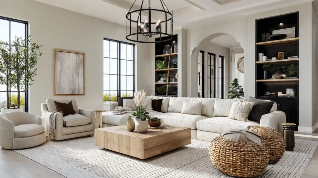
Modern interiors emphasize clean lines and simplicity.
Recommended colors include:
- White
- Warm White
- Gray
- Charcoal
- Black accents
Pair these shades with glass furniture, sleek lighting, and minimalist décor for a sophisticated finish.
Scandinavian
Scandinavian design focuses on brightness, functionality, and natural materials.
Popular colors include:
- White
- Cream
- Soft Gray
- Pale Sage Green
- Light Beige
Complete the room using oak furniture, linen fabrics, woven baskets, and plenty of natural light.
Japandi
Japandi combines Japanese minimalism with Scandinavian comfort.
Choose earthy, calming colors such as:
- Greige
- Taupe
- Sage Green
- Warm White
- Olive Green
Add natural wood, ceramic accessories, linen curtains, and handcrafted décor to reinforce the peaceful atmosphere.
Luxury Interior Design
Luxury living rooms feature rich colors paired with premium materials.
Popular palettes include the following:
- Navy Blue
- Charcoal
- Cream
- Emerald Green
- Soft Beige
Combine these colors with velvet sofas, marble coffee tables, brass lighting, and walnut furniture for a timeless upscale appearance.
Farmhouse
Farmhouse interiors embrace warmth and rustic charm.
Ideal colors include:
- Cream
- Beige
- Warm White
- Sage Green
- Soft Gray
Wooden beams, vintage accessories, cotton textiles, and distressed finishes complement this inviting style.
Coastal
Coastal homes feel bright, fresh, and relaxing.
The most suitable colors are:
- White
- Soft Blue
- Sandy Beige
- Seafoam Green
- Light Gray
Natural fibers, driftwood-inspired furniture, and airy fabrics complete the coastal aesthetic.
Industrial
Industrial interiors balance raw materials with darker tones.
Best choices include:
- Charcoal
- Gray
- Black
- White
- Rust
Pair these colors with exposed metal, concrete finishes, reclaimed wood, and leather furniture for an authentic industrial look.
Choosing Colors Based on Room Size & Lighting
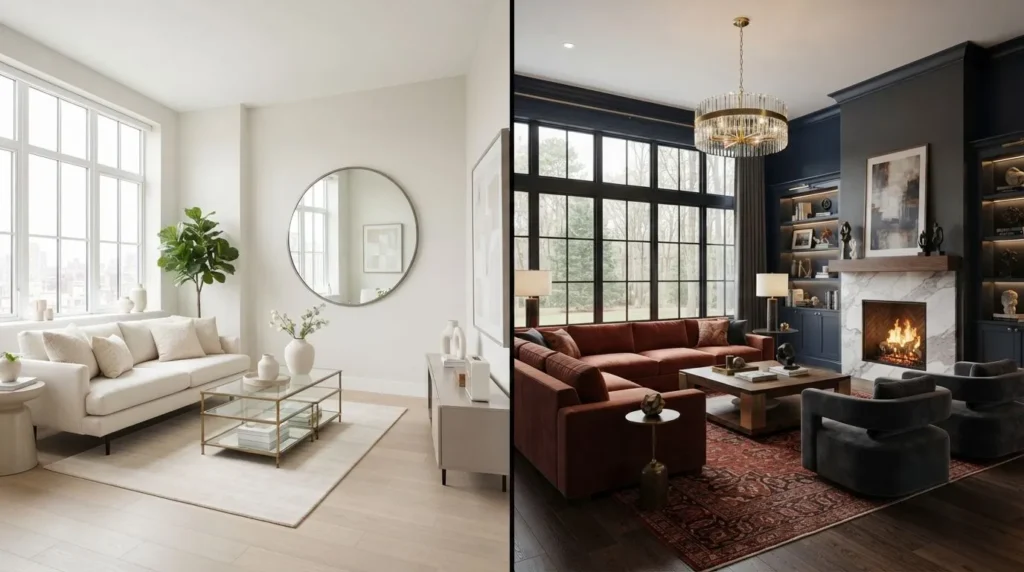
Even the most beautiful paint color can look completely different depending on room size and lighting. Considering these factors before painting ensures your chosen palette enhances both comfort and visual appeal.
Small Living Rooms
Smaller spaces benefit from light-reflective colors that create an open feeling.
Excellent options include:
- Warm White
- Cream
- Greige
- Soft Blue
- Pale Sage Green
Avoid using multiple dark colors, which can make compact rooms appear crowded.
Large Living Rooms
Spacious living rooms can successfully accommodate richer colors that create warmth and intimacy.
Consider:
- Navy Blue
- Charcoal
- Olive Green
- Terracotta
- Chocolate Brown
These deeper shades help large rooms feel cozy while maintaining sophistication.
North-Facing Rooms
North-facing rooms generally receive cooler natural light.
Balance the space using warm shades such as:
- Cream
- Beige
- Warm White
- Taupe
- Soft Terracotta
These colors prevent the room from feeling dull or cold.
South-Facing Rooms
South-facing rooms receive abundant sunlight, allowing homeowners to experiment with both cool and warm palettes.
Excellent choices include:
- Sage Green
- Gray
- Navy Blue
- Soft Blue
- White
Natural daylight keeps these colors vibrant throughout the day.
Rooms with Limited Natural Light
Darker rooms benefit from reflective finishes and brighter colors.
Choose:
- Ivory
- Warm White
- Cream
- Pale Greige
Use mirrors, layered lighting, and satin-finish paint to maximize brightness and create a welcoming atmosphere.
Matching Furniture with Wall Colors
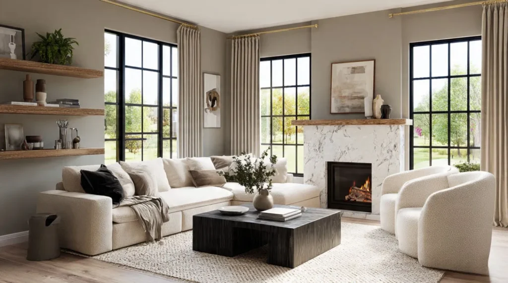
Selecting the right wall color is only half the design process. Coordinating furniture, flooring, and decorative accessories ensures your living room feels balanced and professionally styled.
Matching Sofas with Paint Colors
Your sofa is typically the largest furniture piece in the room, making color coordination essential.
Some designer-approved combinations include:
- Gray sofa + White, Sage Green, or Navy walls
- Beige sofa + Olive Green or Cream walls
- Brown leather sofa + Warm White or Taupe walls
- White sectional sofa + Charcoal feature wall
- Navy sofa + Light Gray walls
These combinations create contrast without overwhelming the room.
Coordinating Curtains and Rugs
Curtains and rugs should support, not compete with, your wall color.
For neutral walls, introduce subtle texture using linen curtains and patterned area rugs.
For darker walls, select lighter curtains and rugs to maintain visual balance while preventing the room from feeling heavy.
Layering different textures such as cotton, wool, and woven fabrics adds depth even within a neutral color palette.
Using Wood, Marble, and Metal Accents
Premium materials instantly elevate any living room color scheme.
Popular pairings include:
- Oak furniture with white or cream walls
- Walnut cabinetry with greige or beige walls
- Marble coffee tables with navy or charcoal palettes
- Brass lighting for luxury interiors
- Black metal accents in modern and industrial homes
- Velvet chairs for elegant contemporary spaces
Combining quality materials with carefully selected colors creates a timeless living room that remains stylish for years while adding both warmth and sophistication.
Trending Living Room Colors for 2026
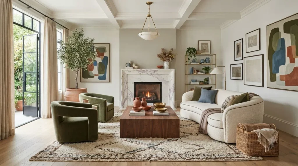
Interior design trends for 2026 focus on creating comfortable, timeless spaces inspired by nature. Homeowners are moving away from overly bright or trendy shades and embracing colors that feel warm, sophisticated, and easy to coordinate with modern furniture. These palettes not only enhance visual appeal but also support a relaxing lifestyle.
Designer-Approved Color Trends
Professional designers are favoring versatile shades that blend elegance with practicality. The most popular living room color ideas for 2026 include:
- Warm White – A timeless neutral that brightens every space.
- Olive Green – Brings a rich, organic feel inspired by nature.
- Dusty Blue – Creates a calm and refreshing atmosphere.
- Mocha Brown – Adds warmth and depth while pairing beautifully with natural wood.
- Terracotta – Offers earthy character and complements both modern and rustic interiors.
- Soft Greige – A balanced neutral that works with nearly every décor style.
These colors pair exceptionally well with premium materials like oak, walnut, marble, velvet, linen, and brass, creating interiors that feel both inviting and luxurious.
Sustainable and Nature-Inspired Palettes
Sustainability continues to influence interior design, making nature-inspired palettes more popular than ever. Earth tones and organic textures create a peaceful environment while maintaining long-term style.
For a balanced look, combine:
- Warm White walls with oak furniture
- Olive Green accents and indoor plants
- Terracotta decorative pieces
- Mocha Brown textiles
- Natural linen curtains
- Stone or marble accessories
This combination creates a welcoming living room that feels fresh, elegant, and timeless.
Common Living Room Color Mistakes to Avoid
Even the best paint color can disappoint if it’s used incorrectly. Avoiding these common mistakes will help you achieve a polished, professionally designed living room.
Ignoring Lighting
Paint colors rarely look the same under every lighting condition. Always test paint samples during both daylight and evening hours to see how natural light and artificial lighting affect the final appearance.
Choosing Too Many Bold Colors
Using multiple vibrant colors in one room can create visual clutter. Instead, choose one primary color, a complementary secondary shade, and a few neutral accents to maintain visual balance.
Forgetting Furniture Coordination
Wall colors should enhance, not compete with your furniture. Consider your sofa, coffee table, flooring, curtains, and decorative accessories before selecting a paint color to ensure a cohesive design.
Skipping Paint Samples
Never rely solely on paint chips or digital images. Apply sample swatches directly to your walls and observe them at different times of the day before committing to the final color.
Final Thoughts
Choosing the right living room color ideas is about more than following trends; it’s about creating a space that reflects your personality while enhancing comfort and functionality. By considering room size, lighting, furniture, and interior style, you can confidently select a color palette that remains beautiful for years to come.
Whether you prefer timeless neutrals, calming greens, luxurious blues, or warm earth tones, the perfect living room color combination can completely transform your home into a stylish and welcoming retreat.
Frequently Asked Questions
Which color works best for a living room?
The best color depends on your home’s style, lighting, and furniture. Warm White, Cream, Greige, Sage Green, and Soft Gray remain timeless choices because they complement a wide range of decor styles while making living rooms feel comfortable and inviting.
What paint colors can make a living room appear more spacious?
Light-reflective colors such as white, cream, ivory, soft beige, pale gray, and light sage green create the illusion of a larger space by reflecting more natural light and reducing visual heaviness.
What are the most popular living room color combinations?
Some of the most popular combinations include:
White and Oak
Gray and Navy Blue
Cream and Walnut
Beige and Olive Green
Sage Green and White
Black and Gold
These pairings provide a balanced mix of warmth, contrast, and timeless elegance.
How do I choose a living room color palette?
Start by evaluating your room size, lighting, flooring, and existing furniture. Choose a primary wall color, then select complementary accent colors that enhance your décor while maintaining harmony throughout the room. Testing paint samples before making a final decision is always recommended.
What colors work best with gray or beige sofas?
Gray sofas pair beautifully with white, greige, sage green, navy blue, and soft blue walls. Beige sofas work especially well with cream, olive green, taupe, warm white, and terracotta, creating a warm and welcoming atmosphere.